Quick Summary
| Key Insight | What You Need to Know |
|---|---|
| Clarifying Your Value Proposition | Does a new visitor instantly get why your product is the best choice for them? |
| Building Trust Signals | Are your return policies easy to find? Do you show off customer reviews and secure payment logos? |
| Simplifying User Actions | Count the clicks it takes to buy something. Can you reduce them? How many fields are in your checkout form? |
| Optimizing for Mobile | We all know mobile traffic is huge, but mobile conversion rates almost always lag behind desktop. This gap is your single biggest opportunity. |
So, you're wondering how to really move the needle on your e-commerce conversion rate? The secret isn't one giant, earth-shattering change. It’s about taking a comprehensive look at the entire customer journey—from the moment they land on your site to the final thank you page—and making smart, targeted improvements along the way.
Think of it as smoothing out all the little bumps in the road. Even tiny fixes can add up to huge revenue gains, often without spending a single extra dime on ads.
Why Small Wins Create Big Momentum
It's tempting to hunt for that one "silver bullet" that will double your sales overnight. But in my experience, the most sustainable growth comes from the steady accumulation of small, almost unnoticeable wins. Nudging your conversion rate up by just 0.5% might not sound like front-page news, but the impact on your bottom line is massive. This is the heart and soul of conversion rate optimization (CRO): turning marginal gains into unstoppable momentum.
This isn't about throwing things at the wall and seeing what sticks. It’s a calculated process. When you fix one small point of friction, it creates a positive ripple effect. A clearer product description gets more people to click "Add to Cart." Combine that with a slightly simpler checkout form, and suddenly you have more completed purchases. Each win builds on the last.
The Real Math Behind Minor Improvements
Let's look at what this means in plain dollars and cents. A small tweak could very well fund your next big marketing push.
Globally, e-commerce conversion rates hover in a tight band, typically between 1.6% and 2.7%. Now, imagine you lift your store's rate from a respectable 2% to a solid 3%. That single percentage point increase isn't just a small bump—it's a 50% jump in sales from the exact same amount of traffic.
The table below shows just how powerful that 1% lift can be.
Revenue Impact of a 1% Conversion Rate Increase
This table illustrates the direct monthly revenue increase from a 1% conversion rate lift at different traffic levels and average order values (AOV), holding ad spend constant.
| Monthly Traffic | Average Order Value (AOV) | Revenue at 2% Conversion | Revenue at 3% Conversion | Monthly Revenue Uplift |
|---|---|---|---|---|
| 10,000 | $50 | $10,000 | $15,000 | +$5,000 |
| 25,000 | $75 | $37,500 | $56,250 | +$18,750 |
| 50,000 | $100 | $100,000 | $150,000 | +$50,000 |
| 100,000 | $125 | $250,000 | $375,000 | +$125,000 |
As you can see, the gains aren't just linear; they're exponential. That extra revenue is pure profit you can reinvest into growing the business.
This kind of growth comes from a disciplined approach. You have to systematically find and eliminate the things that cause hesitation or confusion for your shoppers. Start by focusing on these high-impact areas:
- Clarifying Your Value Proposition: Does a new visitor instantly get why your product is the best choice for them?
- Building Trust Signals: Are your return policies easy to find? Do you show off customer reviews and secure payment logos?
- Simplifying User Actions: Count the clicks it takes to buy something. Can you reduce them? How many fields are in your checkout form?
- Optimizing for Mobile: We all know mobile traffic is huge, but mobile conversion rates almost always lag behind desktop. This gap is your single biggest opportunity.
The goal is simple: make buying from your store feel easier, safer, and more intuitive than buying from anyone else. Every piece of friction you remove is another customer you get to keep.
Adopting a Mindset of Continuous Optimization
Treating conversion optimization as a one-and-done project is a surefire way to fall behind. The best e-commerce brands view their website not as a static digital brochure, but as a living, breathing sales floor that's constantly being tweaked and improved based on real customer behavior.
To see how to build this momentum step-by-step, check out this excellent data-driven playbook for improving ecommerce conversion rate. By focusing on small, measurable improvements, you create a powerful cycle of growth that pays for itself over and over again.
Pinpointing the Conversion Blockers in Your Funnel
Your customers are already telling you exactly where your site is failing them. You just have to learn how to listen. Before you can start boosting your e-commerce conversion rate, you need to put on your detective hat. Your mission? Find all the hidden friction points in your sales funnel—the little annoyances and big frustrations that make people hesitate, get confused, and eventually, leave.
Think of your website like a real-world store. Are the aisles a mess? Is the signage confusing? Is the checkout line a mile long? These problems absolutely exist online, but they look like slow pages, broken forms, and a navigation menu that makes no sense. The first real step in any CRO plan is a deep, honest audit of your funnel.
Start with the Numbers
The best place to begin is with the hard data. Tools like Google Analytics give you that 30,000-foot view of the customer journey, highlighting the exact spots where people are bailing. You’re looking for pages with unusually high exit rates or steps in the checkout where huge chunks of users just vanish.
This data tells you what is happening and where. For example, you might discover that 70% of users who add an item to their cart never actually finish the purchase. Or maybe one specific product category has a bounce rate double everything else. These are your red flags—the places to start digging.
Dig Into the "Why" with Qualitative Tools
Once you know where the problems are, you need to figure out why they're happening. This is where qualitative tools are worth their weight in gold, giving you a real window into what your users are actually experiencing.
Heatmaps: Tools like Hotjar or Crazy Egg are fantastic for this. They create a visual map of where users are clicking, where their mouse moves, and how far they scroll. You might find people clicking on images that aren't links, or completely missing your main call-to-action button because it’s hiding below the fold.
Session Recordings: This is basically like looking over a user's shoulder. You can watch real, anonymized recordings of people browsing your site and see firsthand where they get stuck, hit an error, or start rage-clicking in frustration. Honestly, watching just a few of these can give you more "aha!" moments than staring at spreadsheets for a week.
I once worked with a client who was baffled by their terrible mobile conversion rate. We watched five session recordings and immediately saw the problem: a sticky header was completely covering the "Complete Purchase" button on smaller phone screens. It was a simple CSS fix that boosted their mobile conversions by 18% in a week.
Your Quick-and-Dirty Funnel Audit Checklist
Don't get overwhelmed. Just move through your site methodically, from the first click to the final thank you page, and ask the right questions. This keeps you focused on the biggest opportunities first.
Homepage & Category Pages
- Is my value proposition crystal clear within three seconds?
- Is the main navigation actually intuitive?
- Does the search bar deliver relevant products instantly?
Product Detail Pages (PDP)
- Are the product images high-quality? Do they show every angle?
- Is the "Add to Cart" button big, bold, and impossible to miss?
- Are shipping costs and return policies spelled out before checkout?
Cart & Checkout
- Is guest checkout an obvious, easy choice?
- Are there any surprise fees showing up at the last second?
- How many form fields can I kill? Seriously, remove everything that isn't essential.
- Do I offer popular payment options like Apple Pay or PayPal?
This audit isn’t a one-and-done task; it’s something you should constantly revisit. You can even use social media to find clues. The questions customers ask on your posts often point directly to information that's missing on your site. For a deeper dive, check out some of the best tools for social media analytics to add another layer of insight to your audit.
When you combine hard data with real human insights, you build a clear roadmap for fixing the conversion blockers that are quietly costing you sales.
Crafting Product Pages That Persuade and Sell
Think of your product page as your best salesperson. It’s your digital showroom and your final pitch, all wrapped into one. When a potential customer lands here, they’re no longer just window shopping—they’re seriously considering a purchase. This is where you need to erase any doubt, create real desire, and make clicking "Add to Cart" feel like the most natural next step.
A great product detail page (PDP) doesn't just list features; it tells a story that connects with the customer's needs. They aren't just buying a thing; they're buying a solution to a problem or a shortcut to a feeling they want. Your job is to make that connection crystal clear.
Write Descriptions That Solve Problems
Let's be honest: people don't read product descriptions, they scan them for answers. Your number one goal is to make your product's value jump off the page. Drop the corporate-speak and start using the same words your customers use in their reviews or on social media.
The real magic happens when you translate features into tangible benefits. Don't just say a backpack has "water-resistant nylon." Instead, say it "keeps your laptop bone-dry during a surprise downpour." That small shift from what it is to what it does for them is everything.
- Make it scannable: Use bullet points, short paragraphs, and bold text to highlight key info.
- Tell a mini-story: Help shoppers picture themselves using your product and loving it.
- Answer questions ahead of time: Address common worries about sizing, materials, or how to use it before they even have to ask.
We dive deeper into this skill in our guide on how to write engaging blog posts in 2025. The principles of creating compelling copy are universal, and they apply directly to writing product descriptions that sell.
Showcase Your Product with High-Impact Visuals
In e-commerce, your photos and videos have to do all the work that touching and feeling a product does in a physical store. High-quality visuals aren't just nice to have; they're essential for building a customer's confidence. In fact, a whopping 93% of consumers say visual appearance is the key deciding factor when they make a purchase.
Good imagery should answer questions without a single word. Show every angle—front, back, side, and close-ups of details like the texture of a fabric or the quality of the stitching. Context is just as important. Selling clothes? Show them on models with different body types. Selling furniture? Put it in a styled room so people can see how it fits in a real space.
A single, well-made product video can often do more in 30 seconds than an entire page of text. It closes the "imagination gap" and helps customers feel certain they're making the right choice.
Build Instant Trust with Social Proof
Shoppers will always trust other shoppers more than they trust you. It’s just human nature. Social proof is the online equivalent of a friend’s recommendation, and it's one of the most powerful conversion tools you have.
You need to place different kinds of social proof right where people hesitate the most: on the product page. This can include:
- Customer Reviews & Star Ratings: Place these right up top, near the product title.
- User-Generated Content (UGC): Nothing sells a product like seeing photos and videos from real, happy customers.
- Testimonials: Pull out specific, powerful quotes that talk about the results or solve a common pain point.
For a deeper look into this, check out these strategies for using effective website testimonials to build trust and boost conversions. You can also use data to figure out where trust is breaking down in your funnel.
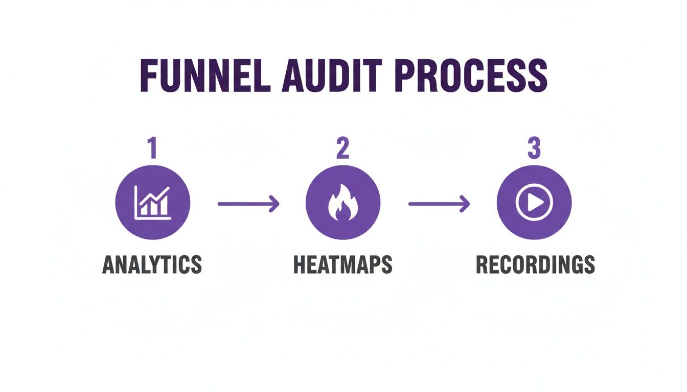
This simple flow—moving from analytics (the "what") to heatmaps and recordings (the "why")—helps you pinpoint exactly where to place trust signals for maximum impact.
Present Pricing with Psychological Finesse
How you show your price can matter just as much as the price itself. The idea is to frame the cost in a way that highlights its value and makes it feel less like a painful expense.
A classic move is "charm pricing"—ending prices in 9 or 99 (like $29.99 instead of $30). Our brains are wired to perceive that price as significantly lower. Another go-to tactic is showing a crossed-out original price next to the sale price; this creates a strong "value anchor" in the customer's mind.
Finally, be brutally transparent about costs. Surprise shipping fees at checkout are the #1 killer of sales. If you offer free shipping, shout it from the rooftops on the product page, not just at the end. This simple act of honesty removes a huge point of friction and reassures the shopper that there are no nasty surprises ahead.
Designing a Frictionless Checkout Experience
Cart abandonment is the silent killer of e-commerce stores. I've seen it time and again: a customer loves the products, trusts the brand, and still bails on a full cart right at the finish line. Why? Usually, it's because of one tiny point of friction.
The checkout is where your highest-intent customers make their final decision. Any hesitation, confusion, or unexpected hurdle can send them scrambling for the "back" button. To truly move the needle on your conversion rate, you have to make this final stage completely seamless.

The real goal here is to design a checkout that’s so intuitive, customers don't even have to think. Every extra form field, every surprise cost, and every unnecessary click is a potential exit ramp. It’s your job to remove all doubt and make the path to purchase overwhelmingly simple.
Simplify and Streamline Your Checkout Form
Think of your checkout form like a conversation. If it's long, drawn-out, and asks too many personal questions, people are going to get annoyed and walk away. Your form needs to be brief, direct, and only ask for what's absolutely essential to get the order out the door.
One of the worst offenders? Forced account creation. Data shows that 24% of shoppers will abandon their cart if you make them create an account. That’s a massive barrier to place right before the finish line.
Here’s how to fix that and other common form issues:
- Make Guest Checkout the Hero: This should be the most obvious, easiest option available. You can always invite them to create an account on the "thank you" page after they've given you their money.
- Trim the Fat from Your Forms: Do you really need their phone number? Does your form have an "Address Line 2" that 99% of people leave blank? Every field you can cut is a small victory that reduces friction.
- Use Smart Form Features: Little things make a big difference. Implement address auto-completion (like Google Maps) and auto-formatting for credit card numbers. These details make the process feel quicker and more polished.
By focusing on these areas, you'll eliminate the most common sources of checkout frustration. For an even smoother experience, think about using customer service automation to answer last-minute questions right in the checkout flow to stop abandonment before it even starts.
Offer Diverse and Convenient Payment Options
Today's shoppers expect choice. If your checkout is limited to just traditional credit cards, you’re alienating a huge chunk of your audience who prefer the speed and security of digital wallets.
Including express payment options like Apple Pay, Google Pay, and PayPal isn't a bonus feature anymore; it's a necessity. These services let customers buy with a fingerprint or a face scan, completely bypassing the chore of typing in card numbers and shipping details. This is an absolute game-changer on mobile, where manual entry is a pain.
Offering a variety of payment methods is a powerful trust signal. It shows that your store is modern, secure, and caters to customer preferences, which can significantly reduce hesitation at the point of payment.
Master the Mobile Checkout Experience
Your mobile checkout isn’t just a shrunken-down version of your desktop site. It needs to be completely re-imagined for a small screen and thumb-based navigation. Honestly, this is where most brands lose the conversion battle.
The data paints a pretty stark picture. While desktop conversion rates often sit around 3.9%, mobile conversion rates lag way behind at just 1.8%. That’s a massive opportunity gap, especially when you consider that most of your traffic is probably coming from mobile devices. You can explore the latest ecommerce conversion rate data to see how you stack up.
To close that gap, your mobile checkout has to be flawless.
Essential Mobile Checkout Optimizations
| Tactic | Why It Matters | Implementation Tip |
|---|---|---|
| Thumb-Friendly Design | Buttons and form fields must be big enough to tap easily without zooming. Nothing causes more frustration than a hard-to-click button. | Make your CTAs span the full width of the screen and give them plenty of space to prevent accidental taps. |
| Single-Column Layout | A single, vertical column is the most natural way for people to scroll through a process on a narrow screen. | Ditch any multi-column layouts that force users to pinch, zoom, and scroll sideways just to see what they're doing. |
| Mobile Page Speed | Mobile users are not patient. If your checkout takes more than a couple of seconds to load, your abandonment rate will go through the roof. | Compress your images, minimize your code, and use a content delivery network (CDN) to make sure every step loads instantly. |
| Clickable Logos | Use large, clear, and recognizable payment provider logos (Visa, PayPal, Apple Pay). They build trust and signal available options at a glance. | Place these logos prominently near the payment section to reassure users that their preferred method is ready to go. |
At the end of the day, a frictionless checkout is all about anticipating what your customer needs and getting every possible obstacle out of their way. By simplifying your forms, offering modern payment methods, and obsessing over the mobile experience, you make buying from your store an easy, confident decision.
Turning Social Media Comments Into Sales
Think of your social media comments as a goldmine. So many brands see them as just a place to rack up likes and engagement, but that’s a huge missed opportunity. Your comment section is a live, public focus group packed with people telling you exactly what they want.
The big challenge, of course, is that traffic from social media has a reputation for converting poorly. People scrolling through Instagram aren't in the same "ready-to-buy" mindset as someone searching on Google. They're exploring, not hunting.
The secret to closing that gap is to start treating every relevant comment like a direct conversation with a customer who has their wallet out. When someone asks, "Where can I get this?" or "Does it come in blue?" they're not just curious—they're signaling they want to buy. Ignoring them is like watching a customer abandon a full cart in your store just because nobody was around to answer a quick question.
Detecting Purchase Intent in the Wild
First things first, you and your team need to get good at spotting buying signals. They aren't always a straightforward "I want to buy this." Purchase intent shows up in a few common ways, and learning to recognize them is key to turning comments into cash.
Look out for these classic signals:
- Direct Inquiries: These are the layups. "How much is this?" or "Do you ship to Canada?" are dead giveaways that someone is already considering a purchase.
- Product Feature Questions: When you see, "Is this machine washable?" or "What are the dimensions?" it means the person is already picturing the product in their life. They've moved past discovery and are now in the evaluation stage.
- Variant and Availability Questions: Comments like, "Do you have this in a size small?" or "When will the green one be back in stock?" show a very specific desire. They've already decided they want it; they just need to know if their preferred option is available.
Jumping on these questions with a quick, helpful answer is your top priority. Each one is a hot lead that can go cold in a matter of minutes.
Creating a Trustworthy Environment with Automation
Let's be real—manually sifting through comments on multiple platforms is a nightmare, especially if you have a large following. High-intent questions can easily get buried under a flood of spam, trolls, and random chatter. This is where automation really shines.
Using an AI tool to manage your comments does two critical things at once: it protects your brand's reputation and shortens the path to purchase. By automatically hiding spam, offensive comments, and links to your competitors, you create a clean, professional space where genuine customers feel safe to engage.
A comment section full of spam and trolls tells potential buyers that the brand isn't paying attention. On the other hand, a clean, responsive feed builds immediate trust and makes you look like a pro.
This is what it looks like to have a clear, centralized dashboard for managing everything. You can see at a glance what needs a human touch and what automation has already handled, so no opportunity slips through the cracks.
Beyond just cleaning up the junk, these tools can be set up to auto-reply to common questions. You can create rules to instantly answer FAQs about shipping, returns, or materials, freeing up your team to focus on more complex conversations. If you want a deeper dive, this complete Instagram comment automation guide breaks it all down.
The Real Conversion Power of Instant Responses
So, what does this look like in practice? Imagine you launch a new product on Instagram. Within minutes, someone comments, "I love this! Does it run true to size?"
Here's a quick comparison of how that plays out with and without smart automation.
Manual vs AI Comment Management for Conversions
Manually managing comments works, but it's slow and often misses the critical window of opportunity. An AI-powered approach is about speed and efficiency, capturing sales while customer intent is at its peak.
| Feature | Manual Management | AI-Powered Management (e.g., FeedGuardians) |
|---|---|---|
| Response Time | Hours, or maybe even a day, depending on when your social media manager is online. | Instantaneous, often replying within a few seconds of the comment being posted. |
| User Experience | The user's initial excitement wears off. They keep scrolling, get distracted, and forget your product. | The user gets an immediate, helpful reply: "It runs true to size! You can find our full size chart here: [link]." |
| Conversion Outcome | The sale is probably lost. That moment of high interest is gone. | The user, feeling confident, clicks the link and is much more likely to complete the purchase on the spot. |
As you can see, the difference is stark. This isn't just about being helpful; it's about striking while the iron is hot. The faster you give a potential customer the exact information they need, the more likely they are to follow through and make a purchase. By turning your comment section into an efficient, trustworthy sales channel, you can start capturing revenue that was previously being left on the table.
Common Questions About Ecommerce Conversion Rates
When you start digging into conversion rate optimization, you'll find it's a world full of data, customer psychology, and constantly changing habits. It's natural to have questions.
Let's cut through the noise and tackle some of the most common ones I hear from store owners. This will help clear up any confusion and get you focused on what actually moves the needle for your business.
What Is a Good Ecommerce Conversion Rate?
This is the million-dollar question, and the honest answer is always, "it depends." You'll see benchmarks everywhere quoting a "good" conversion rate as somewhere between 2% and 3%, but that figure can be incredibly misleading.
Think about it: a store selling high-end, custom furniture will naturally have a lower conversion rate than a shop selling trendy, impulse-buy phone cases. The customer journey is completely different.
Instead of getting fixated on a universal number, focus on your own baseline. The right question to ask is, "What's a good conversion rate for my store, in my niche, with my audience?" The real goal is continuous improvement. If you're at 1.2% today, hitting 1.5% next month is a massive win.
The most successful brands don't obsess over hitting an industry average. They obsess over consistently beating their own historical performance. That’s where real, sustainable growth happens.
How Long Does It Take to See an Increase?
This really comes down to two things: the scale of the change you're making and how much traffic your site gets. You need enough visitors to see a clear, statistically significant pattern.
- Small, simple tweaks—like changing your "Add to Cart" button color or A/B testing a new headline—could show a measurable lift in just a few days if you have a lot of traffic.
- Larger, more complex changes, such as a full checkout redesign or implementing a new personalization strategy, will likely take several weeks or even a month to gather enough data to be confident in the results.
Patience is key here. You can't call a test a success or failure after just 48 hours. Let the data roll in so you're making decisions based on real user behavior, not just a random statistical blip.
Should I Focus on Desktop or Mobile Optimization First?
This is a critical question, but thankfully, your own analytics holds the answer. While desktop often has a higher conversion rate—people just feel more comfortable pulling out their credit cards on a bigger screen—mobile almost certainly drives the majority of your traffic.
Ignoring your mobile experience is a catastrophic mistake in today's market. A clunky, slow, or confusing mobile site doesn't just cost you a sale right now; it actively damages your brand. A shopper who gets frustrated on their phone is highly unlikely to remember you and come back later on their desktop.
Start where your audience is. If 70% of your sessions are on mobile, that’s your starting line. Fixing the friction points there will have the biggest overall impact on your business, even if the per-session conversion rate stays a little lower than desktop. A smooth mobile journey builds trust and keeps your brand in a positive light, which is crucial for your reputation. If you want to dive deeper into this, you can find great tips in this online reputation management guide for 2025.
Ultimately, you need both to be great. But if you have to prioritize, follow the traffic. Optimizing for the majority of your visitors first is always the smartest path to growth.
One of the most powerful—and often overlooked—ways to build trust and drive sales is by managing your social media comments. FeedGuardians uses AI to automatically hide spam, spot purchase intent, and answer customer questions in real-time. It turns your comment section into a clean, helpful, and high-converting space.
Learn how FeedGuardians can help you convert more followers into customers today.
Tired of manually moderating comments?
FeedGuardians automates spam filtering, responds to customers, and protects your brand — setup in 3 minutes.